by The Cullector Team
Foundation Shade and Undertone Matching Before You Buy
Stop guessing at the beauty counter. Here's how to read your undertone, narrow your shade, and shop with confidence.
Getting foundation shade and undertone right is one of those things that sounds complicated until someone actually explains it clearly — and then suddenly it all clicks. The wrong shade doesn't just look off in photos; it can make your skin appear flat, ashy, or oddly orange in everyday light. The right one disappears into your skin like it was always there. This guide walks through how to find your foundation shade and undertone, what the terms actually mean, and which foundations from NARS, Fenty Beauty, Clarins, and Drunk Elephant are worth considering once you know what you're looking for.
We evaluated these foundations based on shade range, undertone labeling, finish, coverage, formula type, and price point — with supporting detail drawn from brand and retailer product information and customer feedback. Whether you're shopping for the first time or finally ready to ditch a foundation that's never quite worked, this guide will help you narrow things down with a lot less trial and error.
One note before we dive in: foundation is personal. The "right" shade is the one that matches your unique skin — its depth, its warmth or coolness, and its surface texture. What works beautifully on one person may not translate at all to another, even within the same shade family. Use this guide as a starting point, not a prescription.
How Do You Determine Your Skin Undertone for Foundation?
To determine your skin undertone for foundation, look at the veins on your inner wrist in natural light: blue or purple veins typically indicate a cool undertone, green veins suggest warm, and a mix of both points to neutral. You can also observe how your skin reacts to sun exposure — warm undertones tend to tan easily, while cool undertones burn more readily. Olive undertones sit in their own category, often appearing neutral-to-warm with a subtle grayish or greenish cast that requires specific shade matching.
Foundation Undertone Guide: Warm, Cool, Neutral, and Olive Explained
Before you shop, it helps to understand what undertone labels on foundation packaging actually mean — because they vary by brand and aren't always consistent. Here's a quick breakdown to use as your foundation undertone guide:
- Warm undertones have yellow, peachy, or golden hues. Foundations labeled W, Y, or "warm" are usually the right direction. If foundation tends to look orange on you, you're likely reaching for something too warm or too deep.
- Cool undertones have pink, red, or bluish hues. Look for labels like C, P (pink), or "cool." If foundation looks ashy or gray on your skin, it may be running too cool.
- Neutral undertones sit between warm and cool — neither particularly pink nor yellow. Shades labeled N or "neutral" tend to work well, and this undertone has the most flexibility across formulas.
- Olive undertones are often misidentified. Olive skin has a greenish or grayish quality that sits at the intersection of warm and neutral. Many people with olive undertones find that foundations run either too pink or too orange on them. Look for shades specifically labeled "olive" or test carefully before committing.
A useful shortcut: swatch foundation on your jawline — not your hand or wrist — and check it in natural daylight. The shade that disappears into your skin after a few minutes of wear is your match.
How to Find Your Foundation Shade: Depth vs. Undertone
Matching foundation to skin tone involves two distinct variables: depth (how light or dark your skin is) and undertone (the underlying hue). Getting both right is how you find a foundation that truly blends. Shade names like "Fair," "Light," "Medium," "Tan," "Deep," and "Rich" refer to depth. The letters or descriptors that follow — W, C, N, warm, cool, pink, olive — refer to undertone.
Many people make the mistake of focusing only on depth and grabbing the closest shade, then wondering why it looks off. A foundation that is the right depth but wrong undertone will look "almost right" in the store but noticeably mismatched in photos or different lighting. Conversely, getting the undertone right but misjudging depth will make the foundation too light or too dark. Both elements matter equally.
When shopping online — which is increasingly common — pay attention to shade descriptions, not just the product image. Colors render differently on screens. Look for brands that offer detailed undertone descriptors in their shade names, and if you've found a match in one brand's formula, note the depth and undertone labels and use them as a reference when shopping elsewhere. For more guidance on building a complete beauty routine around your skin, our beauty category covers everything from skincare to complexion products.
The issue of foundation being too dark or too light is extremely common when shopping online or switching formulas. Even within the same brand, different foundation formulas can run slightly warmer, cooler, or more pigmented than each other. When in doubt, go one shade lighter than you think — most foundations oxidize slightly on the skin, meaning they deepen a touch after application.
NARS
NARS offers three distinct foundation formulas at the same $55 price point, each designed for different skin types and finish preferences. What makes them worth attention here is their clear undertone labeling and broad shade depth range — both useful if you're still dialing in your match. We evaluated all three based on formula type, finish, coverage, and how each addresses different skin concerns.

Light Reflecting Advanced Skincare Foundation
This foundation blends skincare and coverage in a formula designed to look better as the day goes on. Shade descriptors include depth level and undertone — for example, "Fiji" is listed as L5, light to medium with warm undertones — making it easier to cross-reference with your existing shade knowledge. It's a particularly good option for those who want coverage that doesn't read as heavy or mask-like, and for shoppers prioritizing skin-care-forward ingredients alongside their foundation match. Bear in mind that "light-reflecting" finishes can emphasize texture, so those with large pores may want to test it carefully.
shop
Natural Matte Longwear Foundation
Built for oily and combination skin types, this foundation claims 24 hours of shine control with a pore-softening, soft-focus matte finish. It offers medium-to-full coverage, which makes shade accuracy especially important — higher coverage formulas leave less room for a slight mismatch to blend away. According to product information, the formula is designed to be weightless despite its coverage level, which may suit those who want a polished look without a heavy feel. Worth knowing: matte formulas can accentuate dry patches, so those with dry or dehydrated skin may find the Light Reflecting or a hybrid formula more flattering.
shop
Natural Radiant Longwear Foundation
This is the workhorse of the NARS foundation lineup, with skin-matching technology that's described as adjusting to skin's tone over time. It has a natural-to-radiant finish — sitting between the matte and luminous ends of the spectrum — making it one of the more versatile options among the three if you're unsure of your skin type or how your skin behaves across different seasons. According to product information, shades may vary slightly across NARS formulas depending on coverage and finish, so if you've matched yourself in one NARS foundation, it's worth verifying before assuming the same shade number transfers directly to this one.
shopFenty Beauty
Fenty Beauty is widely recognized for its approach to shade inclusivity, and its foundation range reflects that with detailed undertone descriptors built into most shade names. This makes it a particularly useful brand for those still learning how to determine skin undertone — the labeling does a lot of the work for you. We compared three options across different formula types and price points.

Pro Filt'r Soft Matte Powder Foundation — #440
This powder foundation is offered across a range of clearly labeled shades — for example, shade #110 is described as "light with cool pink undertones," #130 as "light with warm olive undertones," and #140 as "light with warm yellow undertones." That level of specificity in shade naming makes it easier to cross-reference with your undertone knowledge before purchasing. At $20, it's one of the more accessible options among the foundations compared here. Powder foundations tend to suit oily skin types best; those with dry skin may prefer a liquid formula for a more seamless finish. Shade #440 falls in the deeper medium range.
shop
Eaze Drop Stick + Skin Tint Stick Foundation
A skin tint in stick form, this is the lightest-coverage option among the Fenty foundations compared here — which actually makes it a smart choice for beginners working on matching foundation to skin tone. With less pigment, small shade discrepancies are far less noticeable, and the formula is designed to even out skin tone rather than cover it. The stick format is also easy to apply on the go and blend with fingers. If you're still building confidence in your shade-matching skills, starting with a sheer or light-coverage skin tint can take the pressure off while you figure out your undertone preferences. Best suited to those who want a natural, lived-in finish.
shop
Pro Filt'r Soft Matte Longwear Foundation — #470
Shade #470 sits in the deeper range of Fenty's Pro Filt'r line, and the formula is described as a medium-coverage longwear foundation with a soft matte finish suitable for all skin types. According to product information, it carries a 4.6-star rating. The formula is noted by Fenty as providing a natural, luminous finish despite the matte descriptor — which may appeal to those who find pure matte finishes too flat. Please note the price listed here reflects the retailer's local currency display as provided; check the Fenty Beauty site directly for current U.S. pricing. For deep skin tones, this shade range is one of the more comprehensive available among the brands compared here.
shopWarm vs. cool undertone foundation mistakes are the most common reason a shade looks right in-store and wrong everywhere else. Always check in natural light — store lighting is notoriously warm and forgiving.
Clarins USA
Clarins offers foundations that lean heavily into skincare benefits alongside coverage — useful context when evaluating these products as part of a broader routine. Their shade approach emphasizes undertone accuracy, with customer feedback noting the brand's attention to cool and pink undertone options that suit a range of complexions. We compared three formulas across different coverage levels and textures.
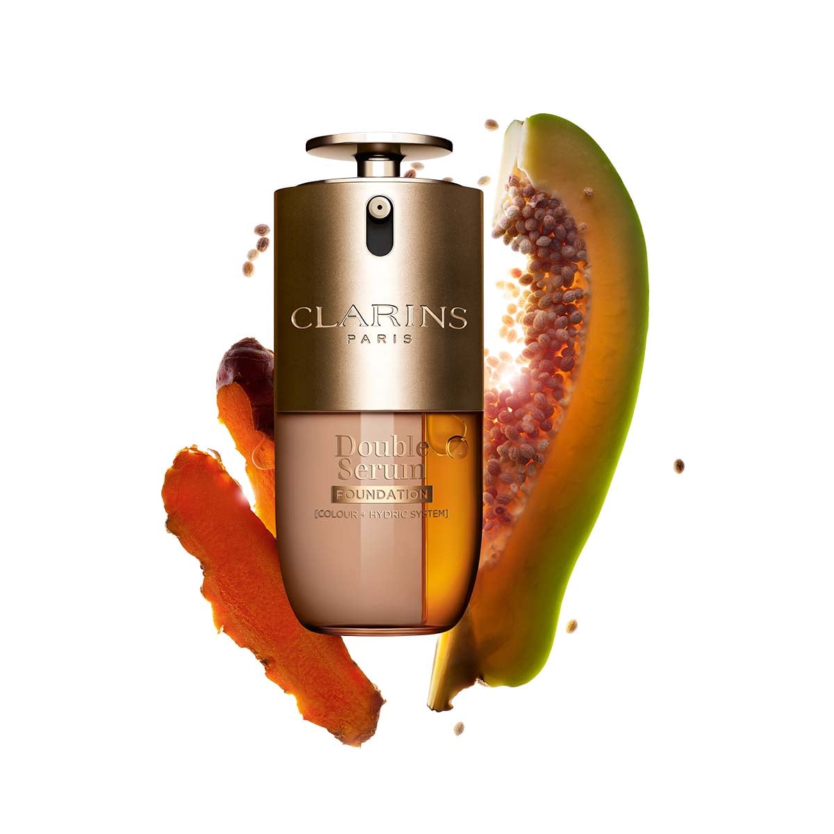
DOUBLE SERUM® Foundation
Available in 37 shades described by Clarins as "skin-true" and "undertone-correct," this is the most shade-comprehensive of the three Clarins options compared here. The emphasis on undertone accuracy in the shade development makes it a considered choice for those who have struggled to find a match — particularly shoppers with cooler or more neutral undertones who often find foundation ranges skewed warm. At $62, it's priced at the higher end among the products in this guide. It works best for those who want their foundation to pull double duty as a skincare treatment, with serum-level ingredients built in. Those who prioritize maximum coverage over skincare benefits may prefer the Skin Illusion Full Coverage option.
shop
Skin Illusion Full Coverage Foundation
Customer feedback on this foundation highlights praise for its color-match precision and a shade range that reportedly includes cool and pink undertones well — which is meaningful for fair-skinned shoppers or those with noticeably pink or rosy undertones who often struggle to find accurate matches. Full-coverage formulas require the most precise shade matching of any finish type, since less of the skin shows through to "correct" a slightly off shade. Those with neutral or warm undertone foundation needs should check the shade descriptor closely before purchasing, as the range skewing cool may mean different shade behavior across the depth spectrum.
shop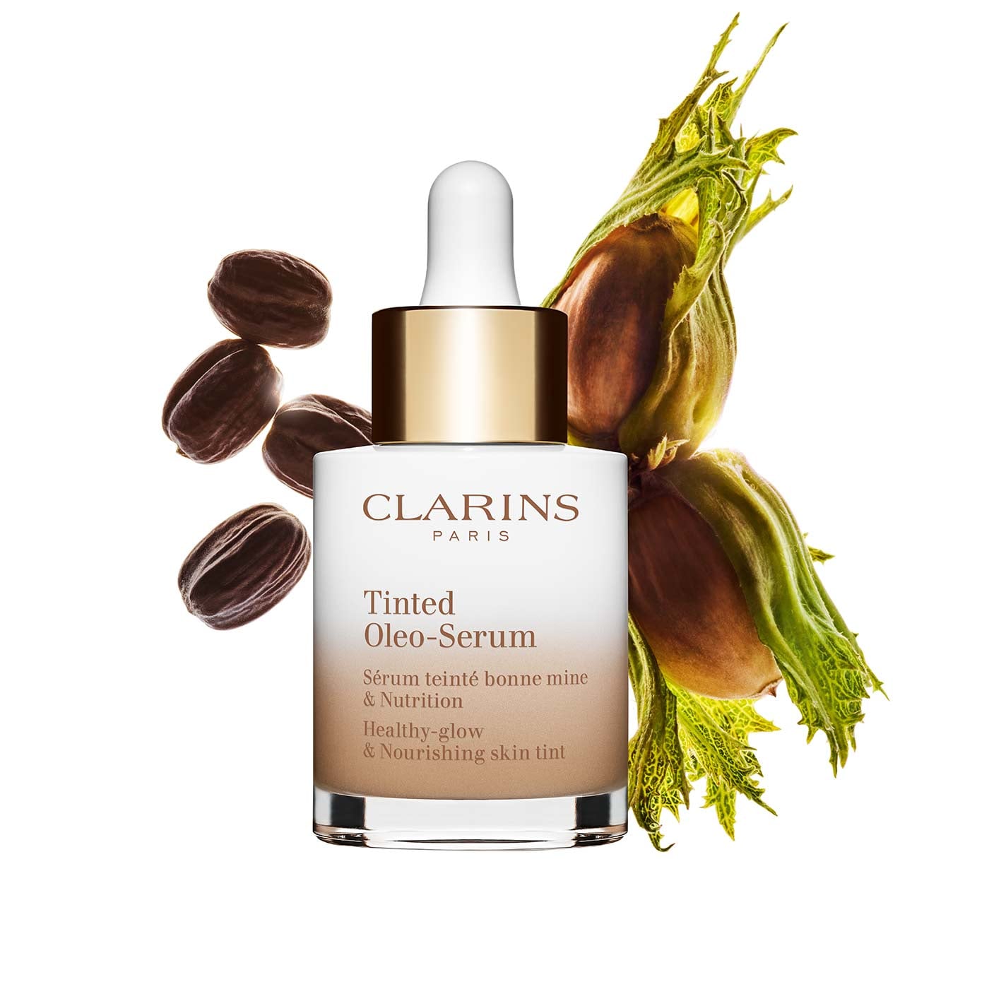
Tinted Oleo-Serum Foundation
At 80% skincare and 98% natural-origin ingredients by Clarins' description, this is a hybrid product — closer to a tinted moisturizer or skin treatment than a traditional foundation. The silky, fluid texture is described as buildable, which means you can apply a sheer layer for a skin-tint effect or layer it for more evening coverage. This kind of formula is useful for shoppers who want a more forgiving shade match — the lighter the coverage, the more your skin shows through and naturally corrects for small undertone differences. Suitable for those exploring foundation shade matching for the first time or transitioning away from heavy coverage. Those with very oily skin may prefer a formula with more defined oil control.
shopDrunk Elephant
Drunk Elephant takes a skincare-first approach to makeup, and their foundation entry reflects that philosophy. Their Kamo Serum Foundation is designed to function as a treatment product alongside providing coverage — a consideration worth weighing when thinking about how a foundation fits into your existing skincare routine. We evaluated the relevant foundation product and the brand's overall approach to shade matching.
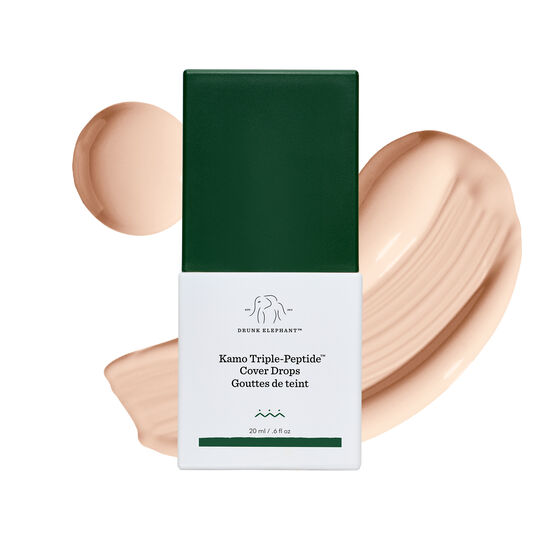
Skin Firming Serum Foundation With Peptides
This peptide-infused serum foundation is described by Drunk Elephant as clinically proven to visibly firm skin over time, while also addressing redness, uneven tone, and the appearance of fine lines in the near term. The image shown here represents the "Fair" shade (01C), which gives an indication of where the shade range begins — useful context if you're shopping for a foundation shade for fair skin in particular. Because this is a serum foundation, the texture and finish will behave differently than a traditional liquid or powder formula: coverage is generally lighter and sheerer, which gives more room for error on shade matching but less ability to correct or cover specific concerns. Worth considering for those who want their foundation to contribute to longer-term skin goals alongside daily coverage. If you're building a complete skincare and makeup routine, our guide to glass skin products covers complementary steps for a luminous complexion.
shopFoundation Shade Matching Tips Before You Commit
A few practical notes that apply across all the foundations compared here — and most foundations in general:
Test on your jawline, not your hand. The skin on your hand and wrist is a different shade and undertone from your face. Your jawline is where you need the foundation to blend seamlessly — between your face and neck — so that's the only accurate test site.
Check in natural light, not store or bathroom lighting. Artificial lighting skews warm and masks undertone mismatches. Take a swatch outside or near a window before deciding. The same rule applies when checking your foundation in the mirror at home for the first time.
Consider the oxidation factor. Many foundations — particularly those with higher pigment loads or oil-absorbing ingredients — will deepen or shift slightly on the skin over the first 10 to 20 minutes of wear. What looks like a match on application might run a shade darker after it sets. This is especially common with matte formulas. When in doubt between two shades, the lighter one is usually the safer starting point.
Cross-reference by coverage level. Sheer and light-coverage foundations are more forgiving of undertone mismatches. Full-coverage foundations are not. If you're testing a new brand or formula, starting at a lighter coverage allows you to identify your correct depth and undertone before committing to a higher-pigment option. Once you've nailed your match in a sheer or medium formula, you'll have a much clearer reference for shopping other products.
Factor in seasonal changes. Skin tone shifts throughout the year — tanning in summer, fading in winter. Many people keep two shades on hand and mix them during transitional months. Brands like NARS and Fenty Beauty offer enough shade depth options that finding two complementary shades within the same range is realistic. For a deeper dive into seasonal beauty routines, the moisturizer comparison and cleansing guide cover how your skincare needs shift alongside your foundation shade across the year.
If you've been wearing the same foundation shade for years without questioning it, it may be worth re-evaluating. Skin changes with age, sun exposure, hormones, and seasons — your foundation should keep up.
How to Choose: Matching Foundation to Skin Tone and Finish
Once you've identified your undertone and depth, the second decision is finish — and it matters almost as much as shade for how your overall look lands. Here's a quick reference based on what we compared across these four brands:
- Matte finish (NARS Natural Matte, Fenty Pro Filt'r Matte): Best for oily and combination skin. Controls shine and provides a soft-focus effect. Can emphasize dry patches on dry or mature skin.
- Radiant or luminous finish (NARS Natural Radiant, NARS Light Reflecting): Best for dry or normal skin types seeking a skin-like, reflective look. Can draw attention to textural concerns like pores or bumps.
- Serum or skin tint (Drunk Elephant Kamo, Clarins Tinted Oleo-Serum, Fenty Eaze Drop Stick): Most forgiving for shade mismatches. Ideal for minimal-makeup looks or beginners still learning their shade. Not the right choice if significant coverage is the goal.
- Full coverage (Clarins Skin Illusion Full Coverage): Best for those with specific concerns to address — redness, hyperpigmentation, or uneven texture. Requires the most precise shade match. Not recommended for fine skin or very dry skin without prep.
Thinking through finish before you shop helps narrow the field considerably. The best foundation for fair skin might be a light-coverage serum formula that lets the skin show through; the best foundation for deep skin tones might be a full-coverage longwear formula with strong pigment depth. The right answer depends on your priorities, not just your shade.
Conclusion: Finding Your Foundation Match
Learning how to find your foundation shade and undertone is a skill that pays off every time you buy a new product. Once you understand the basics — depth vs. undertone, warm vs. cool vs. neutral vs. olive, and how finish affects both coverage and shade perception — you'll spend far less time returning products and far more time actually enjoying your makeup. Among the foundations compared here, NARS offers consistent undertone labeling across three distinct finishes at the same price point; Fenty Beauty's shade descriptor system is one of the clearest for those still figuring out how to determine skin undertone; Clarins provides a strong option for those prioritizing undertone-accurate shades with skincare-forward formulas; and Drunk Elephant's serum foundation suits shoppers who want skincare benefits and a forgiving, lighter coverage. Use Chirpyest to shop these brands and discover more editorial picks across the beauty category — all in one place.
Frequently Asked Questions
What's the difference between a warm and cool undertone in foundation?
Warm undertone foundations contain yellow, peach, or golden pigments that complement skin with a naturally golden or sun-kissed quality. Cool undertone foundations have pink, red, or bluish pigments that suit skin with rosy, pink, or blue-tinged undertones. The easiest way to tell which you need is to observe how foundation looks on your jawline in natural daylight — if it pulls orange or muddy, it's likely too warm; if it looks gray or ashy, it may be too cool.
Can I wear a neutral undertone foundation if I have warm or cool skin?
Neutral undertone foundations can work across a range of skin types because they sit between warm and cool on the spectrum — they're neither distinctly yellow nor distinctly pink. If you have a mildly warm or mildly cool undertone, a neutral shade may blend well enough, especially in lighter coverage formulas. However, those with strongly warm or strongly cool undertones may find a neutral foundation looks slightly flat or off against their skin, and will likely get a better result from a shade that leans in their undertone direction.
Why does my foundation look different in photos than it does in the mirror?
Camera flash and digital image processing often expose undertone mismatches that the eye adapts to in real life — particularly when a foundation pulls too pink or too white, which can appear as a "flashback" effect in photos. This is also common with foundations that contain SPF or optical brighteners, which can read chalky under flash. If your foundation photographs significantly lighter or different than it looks in person, it may be worth reassessing your shade match in outdoor natural light or considering a formula without added optical diffusers.
How do I find the right foundation if I have an olive undertone?
Olive undertone foundation matching is notoriously tricky because olive skin carries a greenish or grayish quality that sits at the intersection of warm and neutral — and many foundation ranges don't label for it specifically. The most common mismatch for olive skin is choosing a shade that's too pink (which clashes with the natural green cast) or too orange (which reads warm but still looks artificial). Look for shades described as "olive," "neutral-to-warm," or with a "Y" (yellow) undertone designation, and always test on the jawline in natural daylight before committing. Fenty Beauty's detailed shade descriptor system and NARS's wide undertone labeling are both useful starting points for olive skin tones.